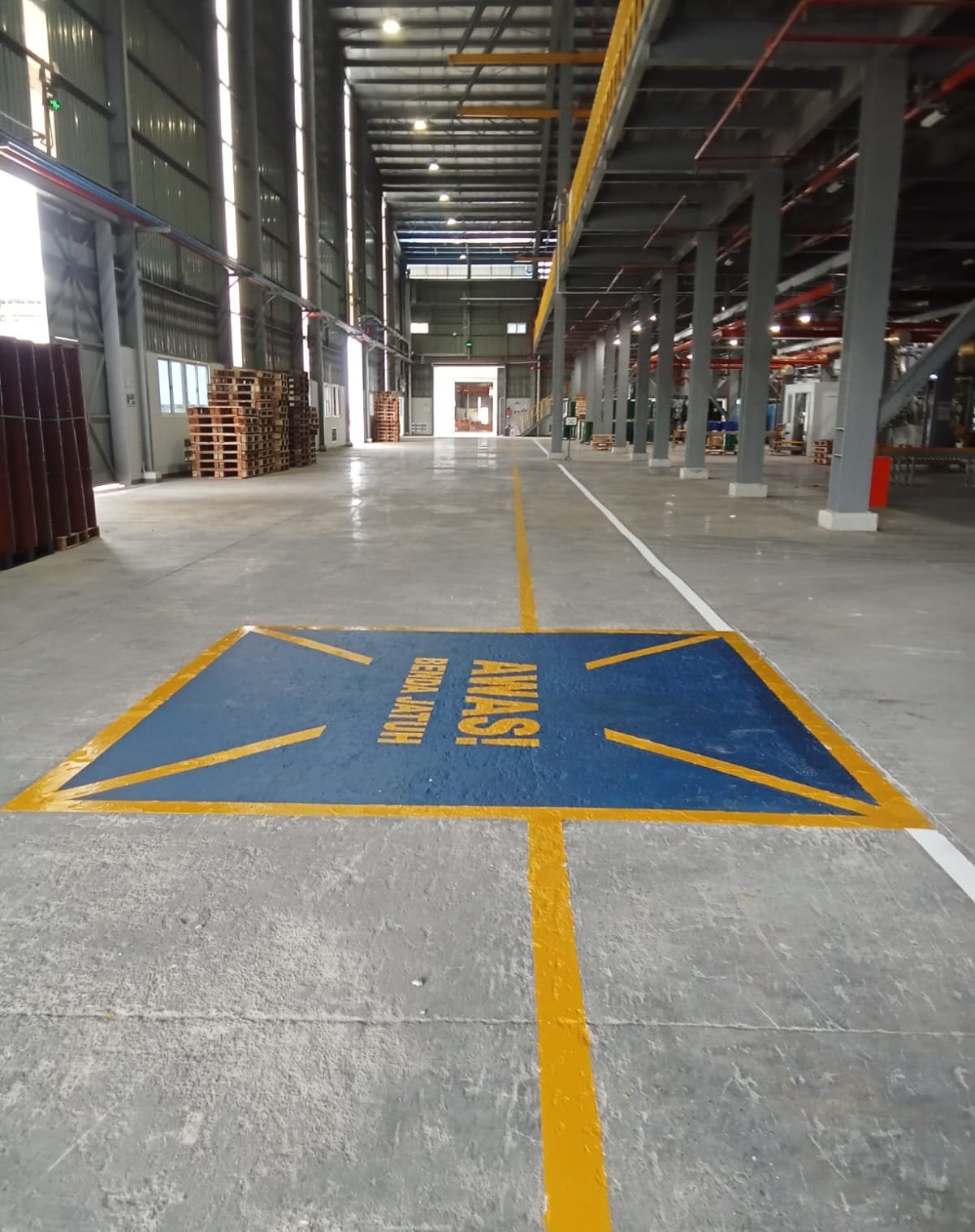
Caution: Falling Objects
Karawang, Indonesia
Main Objective
To increase awareness of overhead falling object risks through a design that is:
Highly visible from a distance, Instantly understandable (visual-first approach), Consistent with industrial safety standards.
Key Visual Elements
Color Scheme
Use high-contrast safety colors:
Yellow → primary warning color, Black → text and symbols, Red (optional) → high-risk or restricted zones.
Iconography
The front area of the building is spacious and open to support the mobility of logistics vehicles and workers. The open layout provides high visibility and easy access.
Landscape Integration (Industrial Landscape Integration)
The presence of small gardens with greenery around the signage provides visual balance between hard elements (buildings and concrete) and natural elements. The landscape serves as both an aesthetic element and a space divider.
Visual Branding & Area Identity
The blue color on the roof provides a strong and consistent visual identity. International standard signage supports a professional and global-ready image.
Orderliness & Cleanliness of the Area
The area looks neat and clean, reflecting good facility management. Clean lines and symmetrical composition reinforce the impression of organization.